Company news
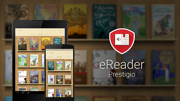
Internal beauty of any application cannot be seen without opening it. What is the best way to appreciate an app from the outside? Definitely, its logo!
Over the past year the eReader Prestigio application underwent huge User Interface changes – it became simpler, smoother, and more user friendly.
The next step was to redesign the logo accordingly. The Prestigio team wanted to keep the originality of the eReader logo and not deviate too far, but at the same time, create a Material Design style similar to that of the application. Also, with the latest updates,Text-To-Speech functionality and audio books playback feature were added, and the logo should inform users about it. So it was decided to add a speaker.
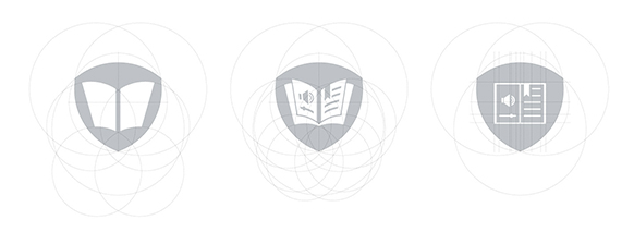
Designers began manipulating designs with open books, trying to give the books a dimension.
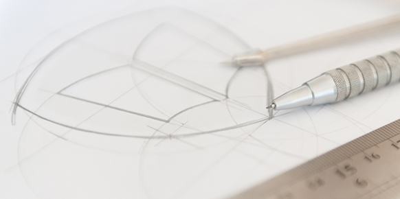
Obviously, a simple open book worked, but when the elements, like a speaker were added inside, the skewing cause by the 3D effect made it look quiet strange, so the idea was abandoned. Making it look totally flat didn’t work out either.
So designers decided to go back a step and get down to the basics: paper, knife, ruler, light, camera – go!
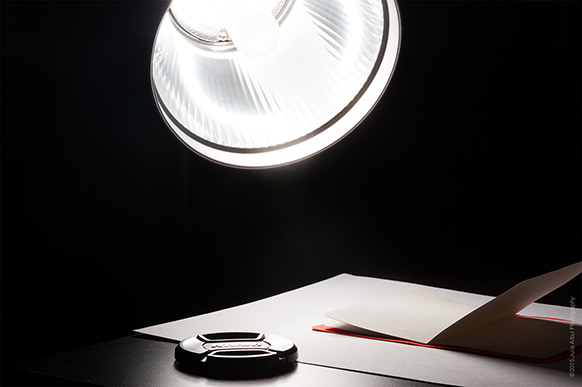
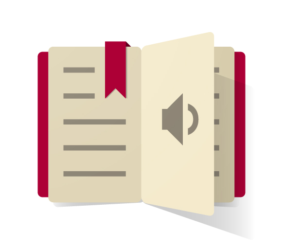
Experiments with light and shadows, turning, cutting, cropping, and throwing paper all over the room, lasted for hours until the desired result was achieved: simple, stylish and elegant - the logo.
Experimenting continued and another version of logo was created: the beauty and the balance of the speaker was kept along with size of the lines to fit inside the golden ratio of the Fibonacci spiral.
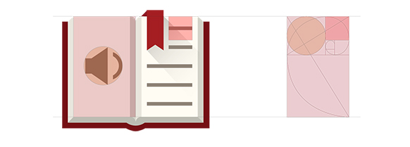
The two logos, completely different in style were created.
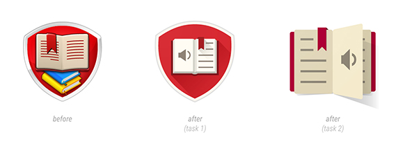
After a voting poll with hundreds of people making their voice heard, the logo was finally chosen.
“Perfection is achieved not when there is nothing more to add, but when there is nothing left to take away” – Antoine de Saint-Exupery
